Sketch/Idea
For redesign, I decided to go in the direction of new packaging for Tampons. The target audience is someone who may be embarrassed, or anxious when purchasing Tampons, and also doesn’t want to be too obvious when sharing them publicly with friends who may need one.
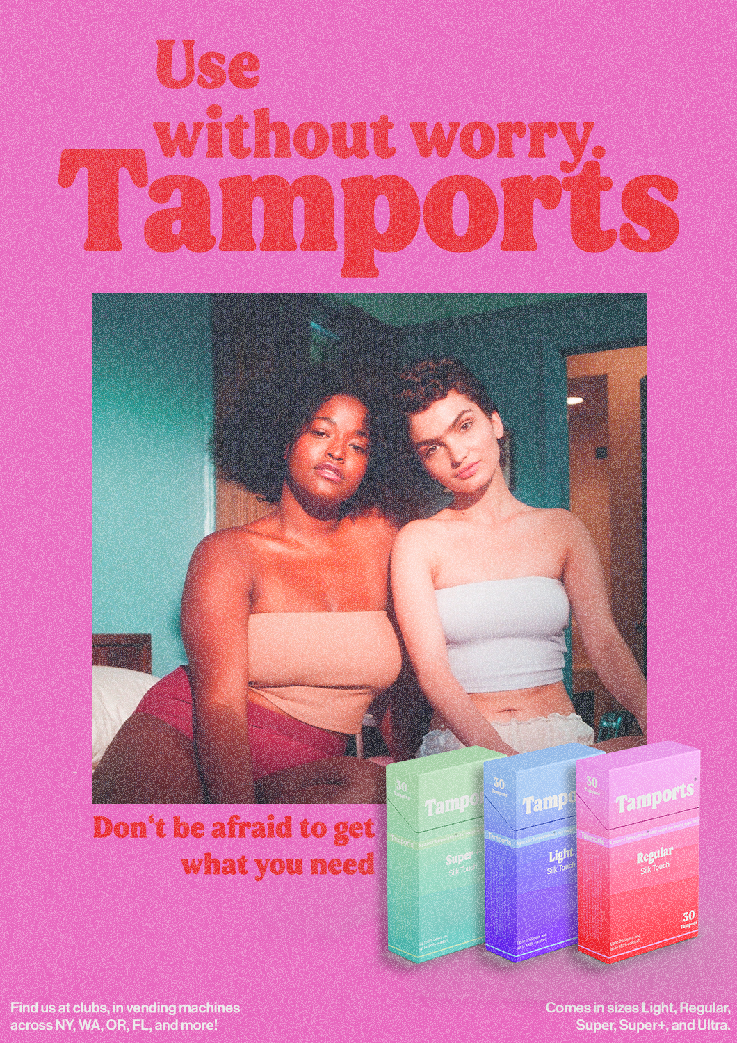
My idea is to use the look of cigarette packaging. The direction of putting this product in the form of something that should be actually disliked in an ironic way can be a funny, and still more inconspicuous way of packaging them.
Because of the way it will look, it will need intense and out-there campaigning and advertising to make sure the target audience knows what they are, and doesn’t actually mistake them for being cigarettes at first glance.

Color Palettes/Gameplan
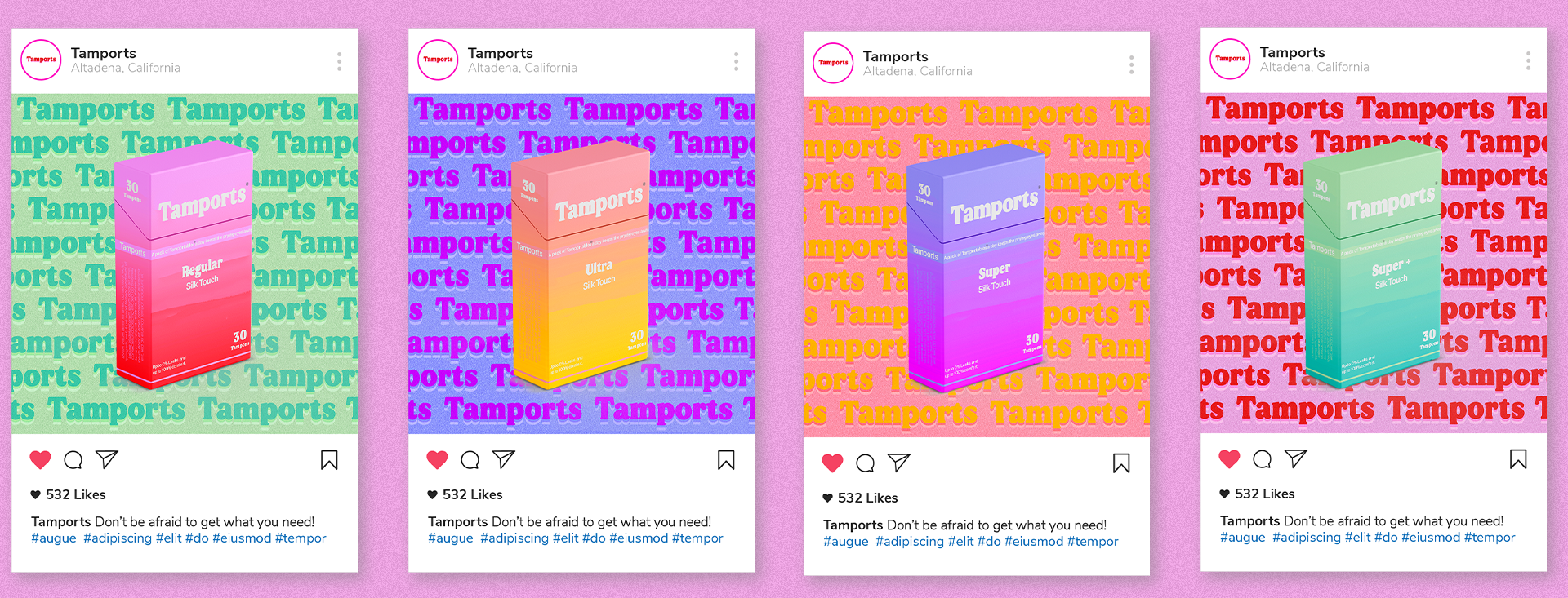
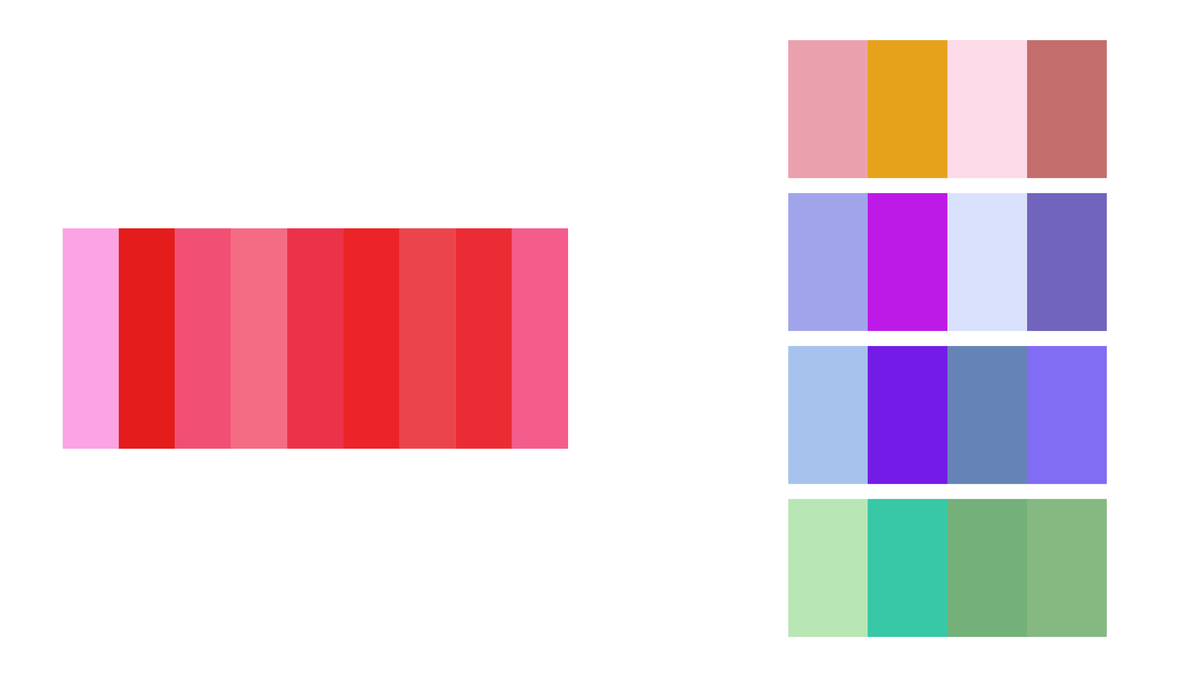
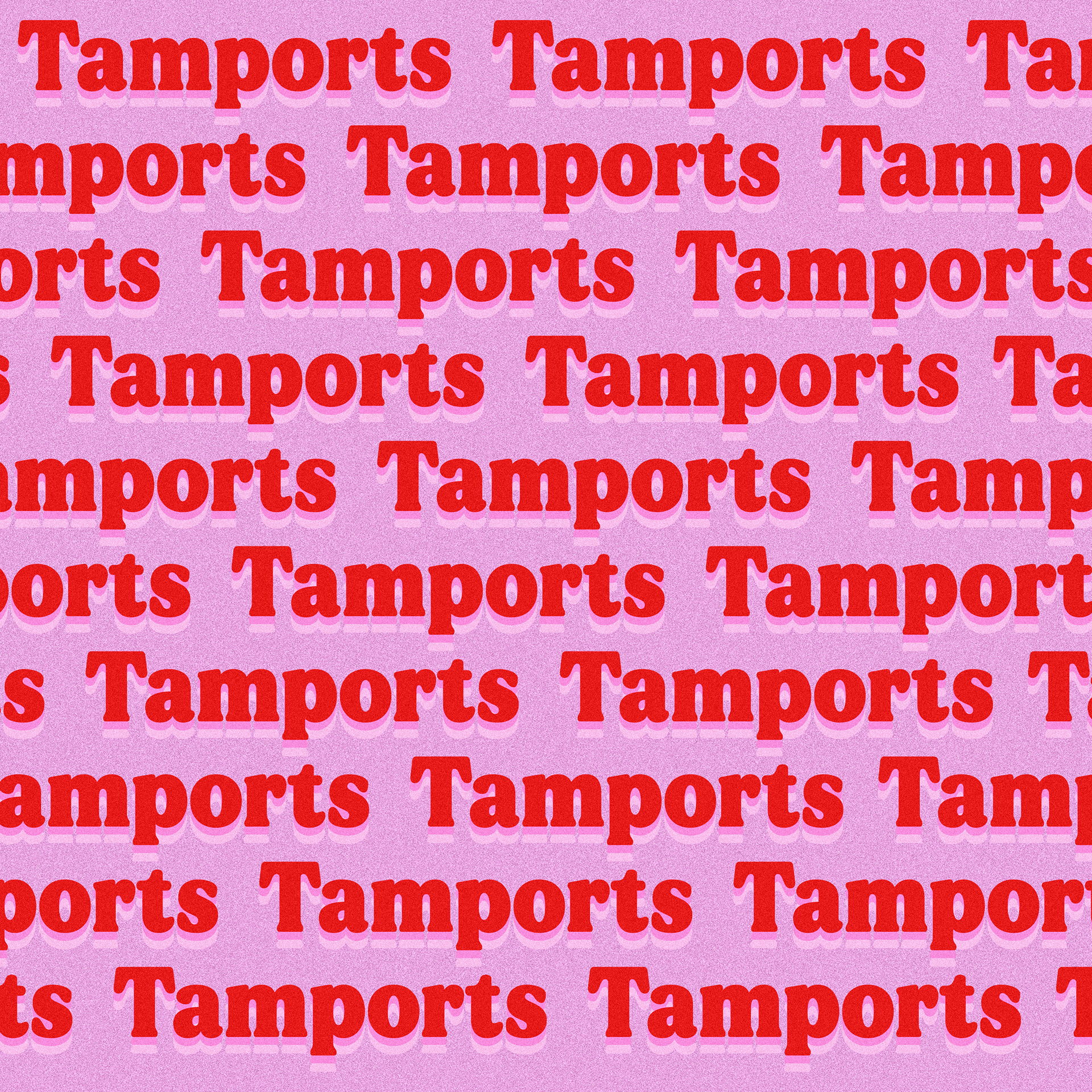
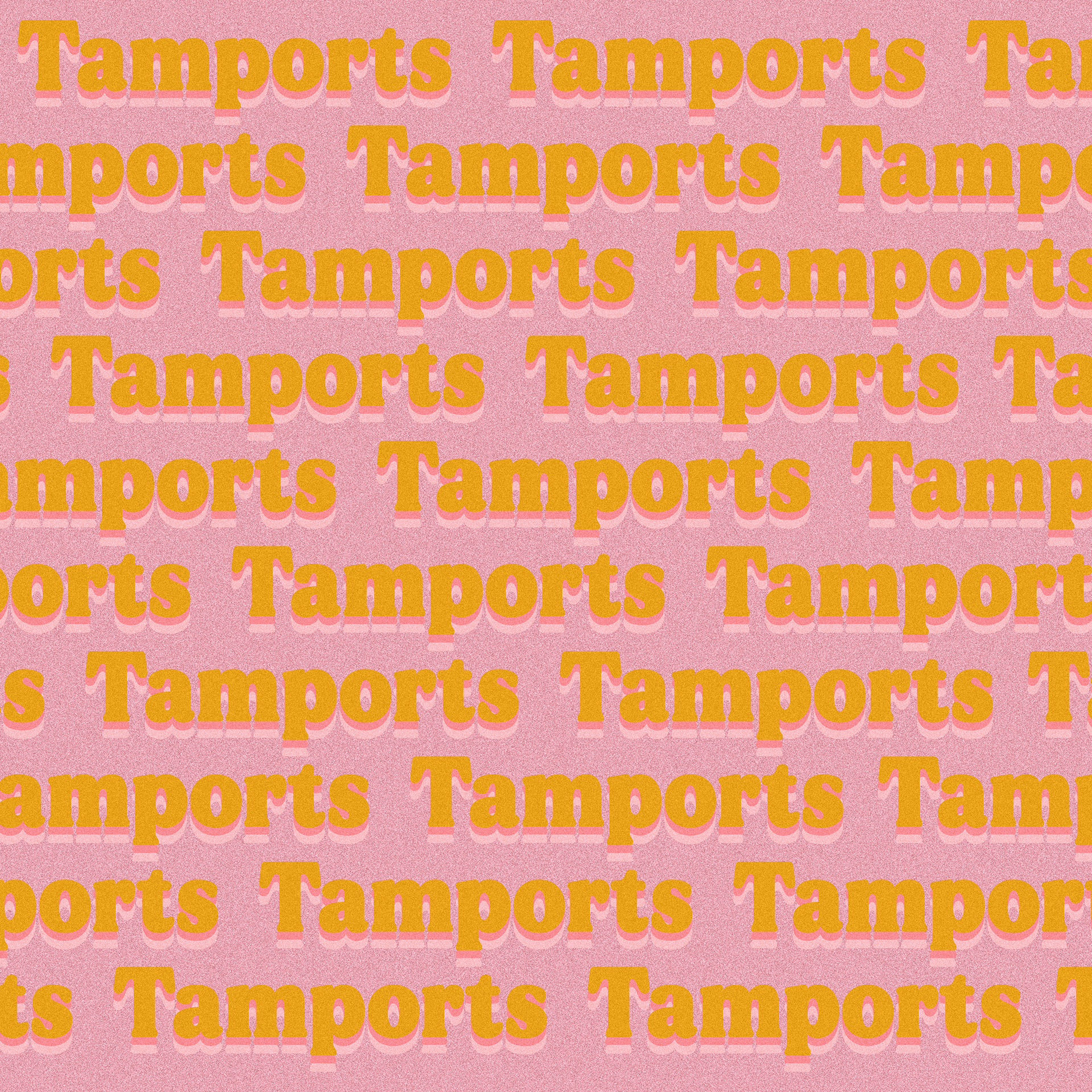
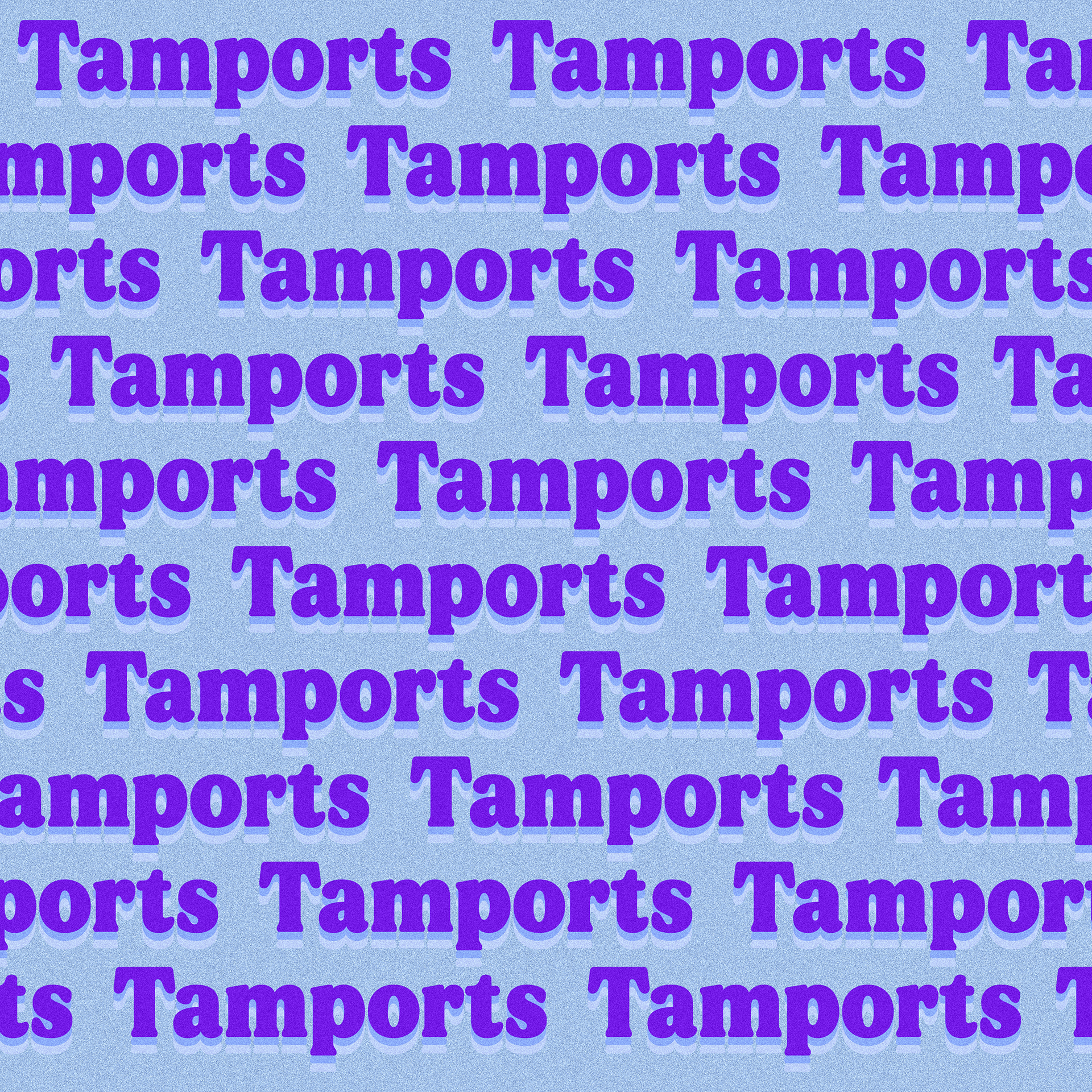
The main color palette is supposed to be bright, fun, and have vintage roots. These colors are trendy and pop out when used on packaging correctly. The secondary colors are used for the differently sized Tampon packaging so as to differentiate and also give the eye something new and cool to look at.
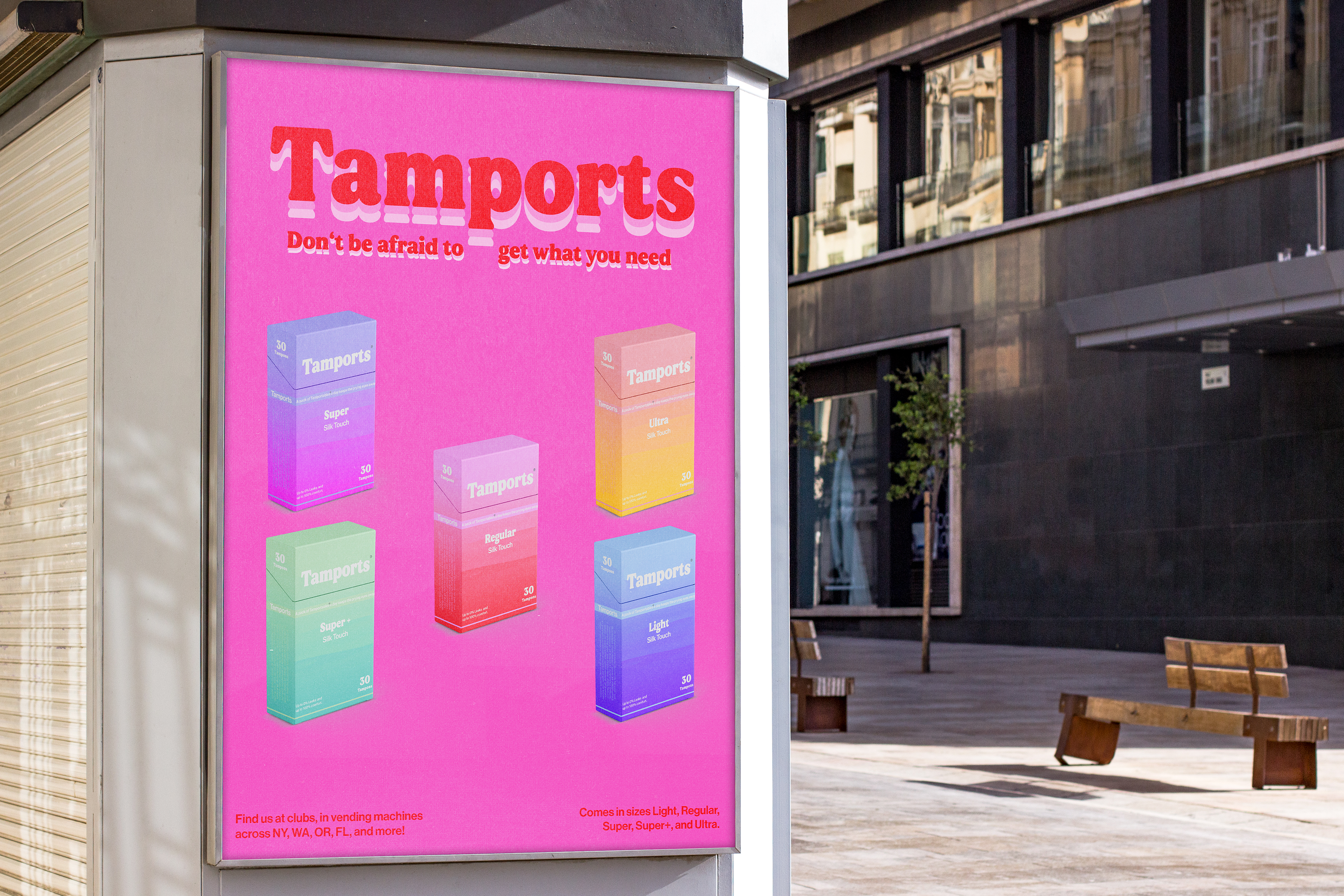
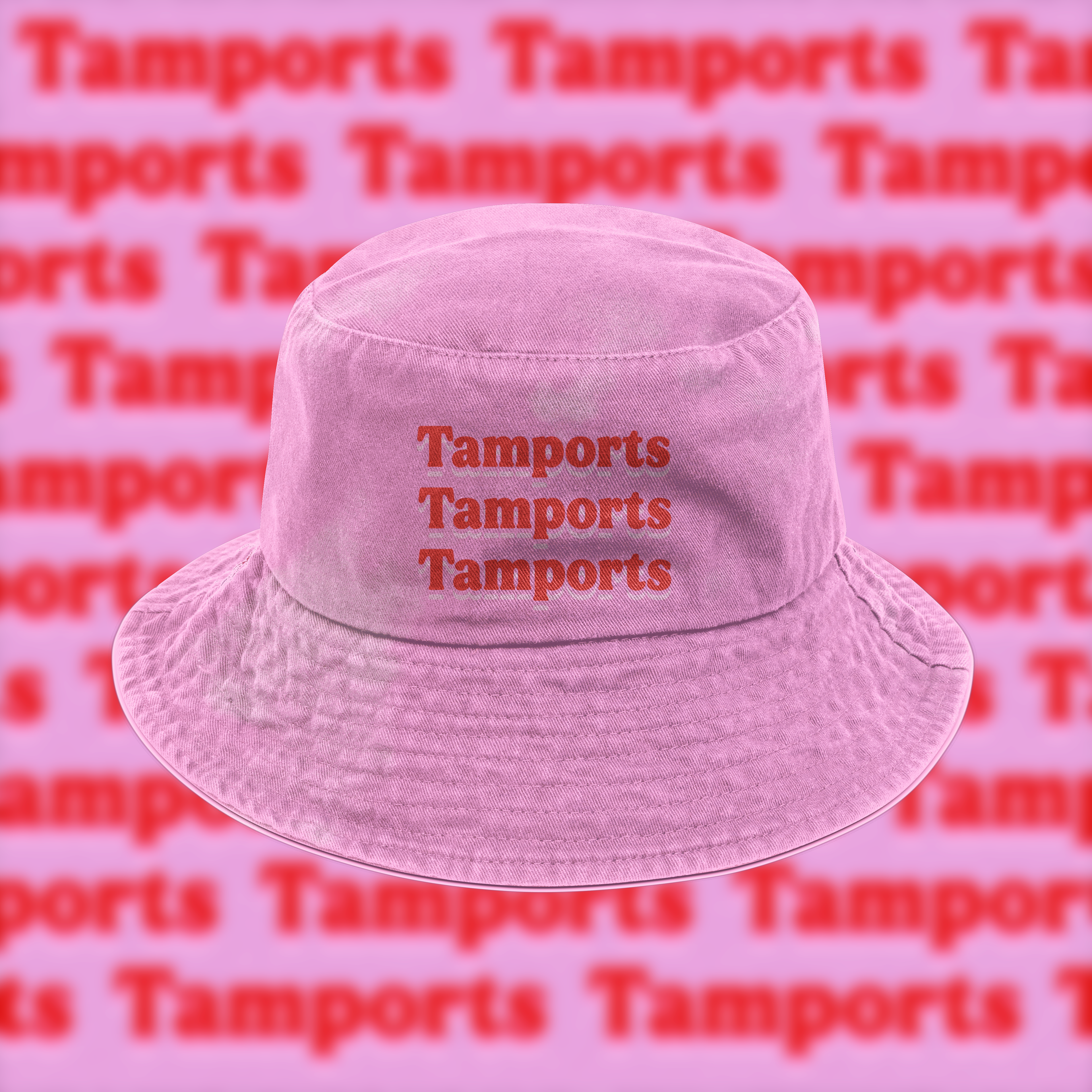
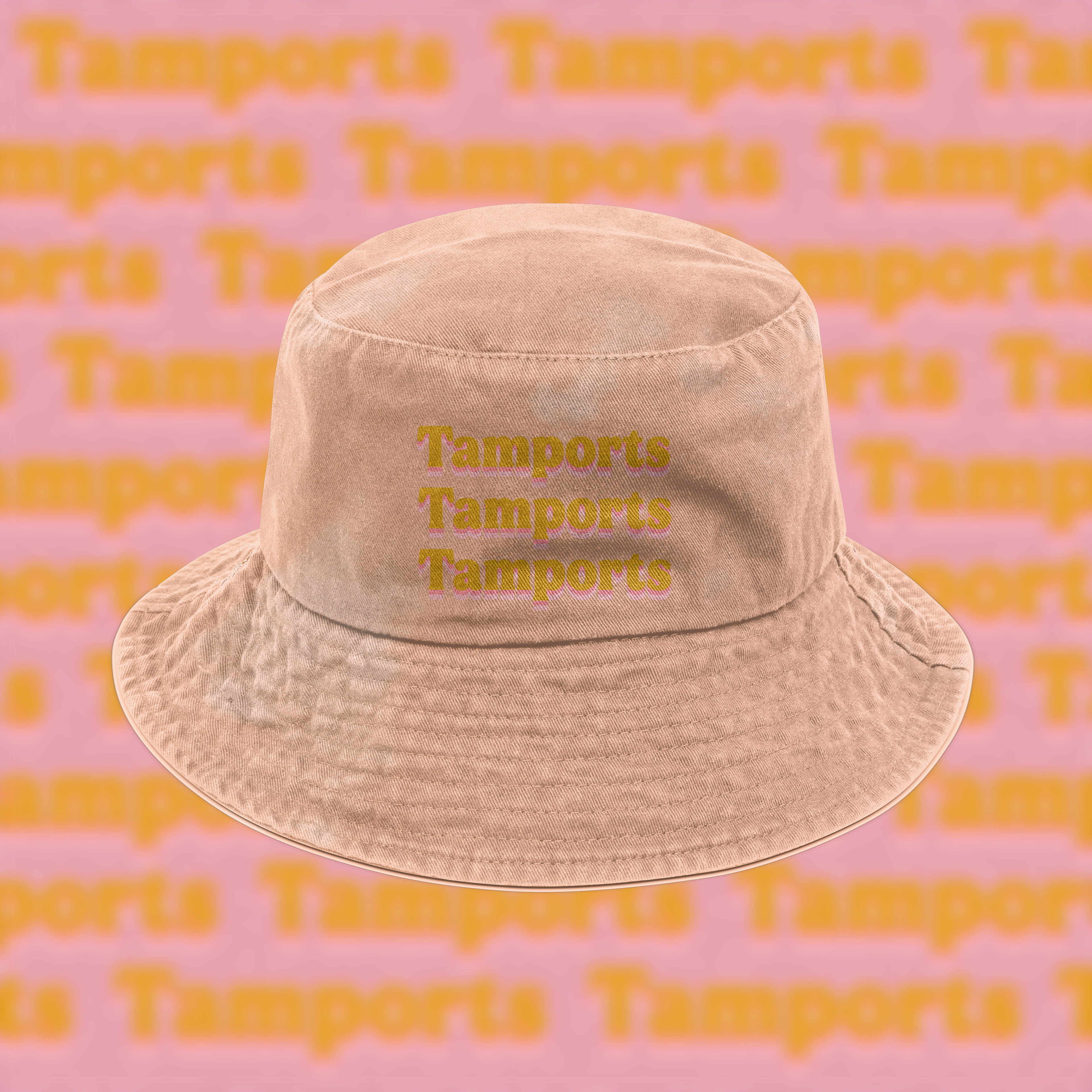
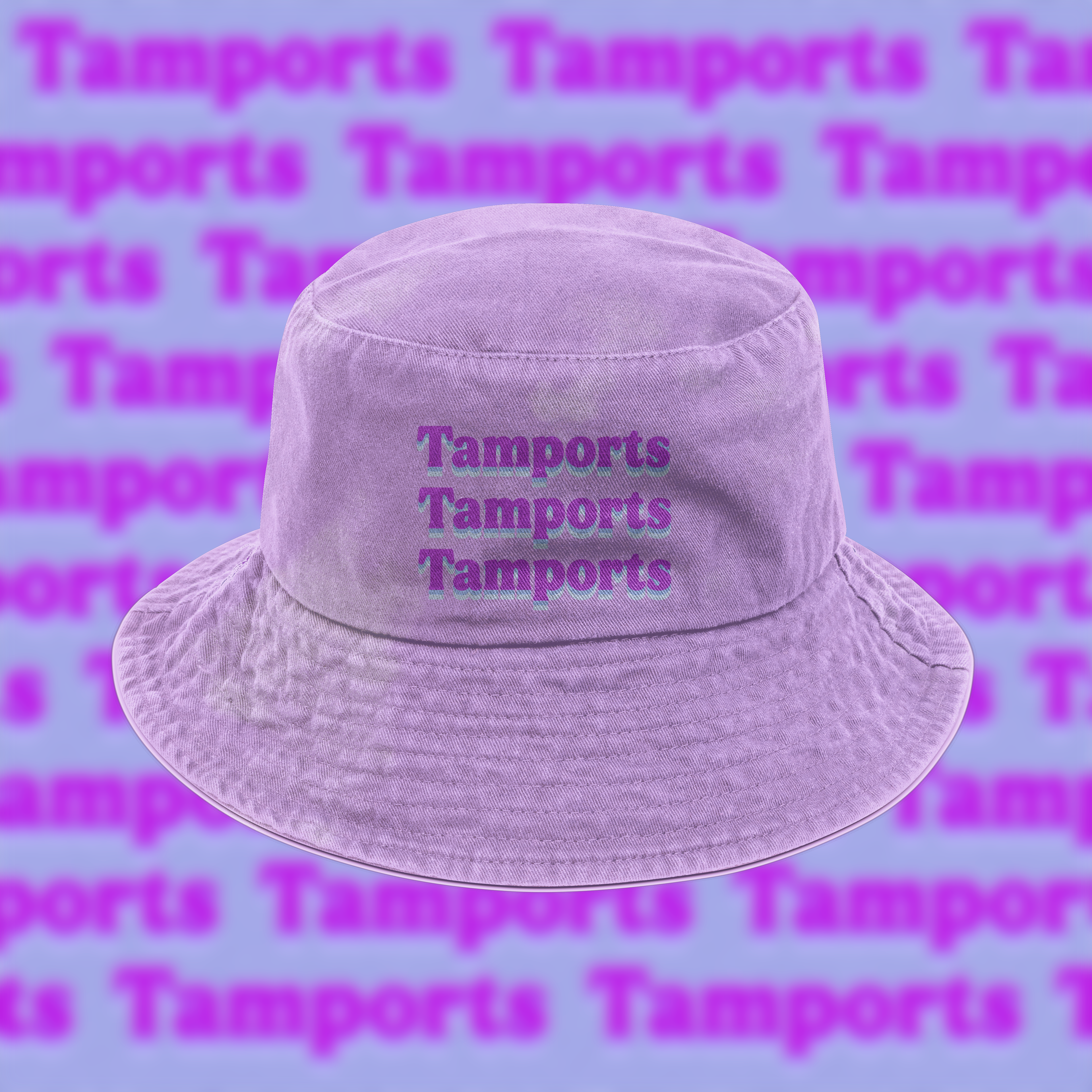
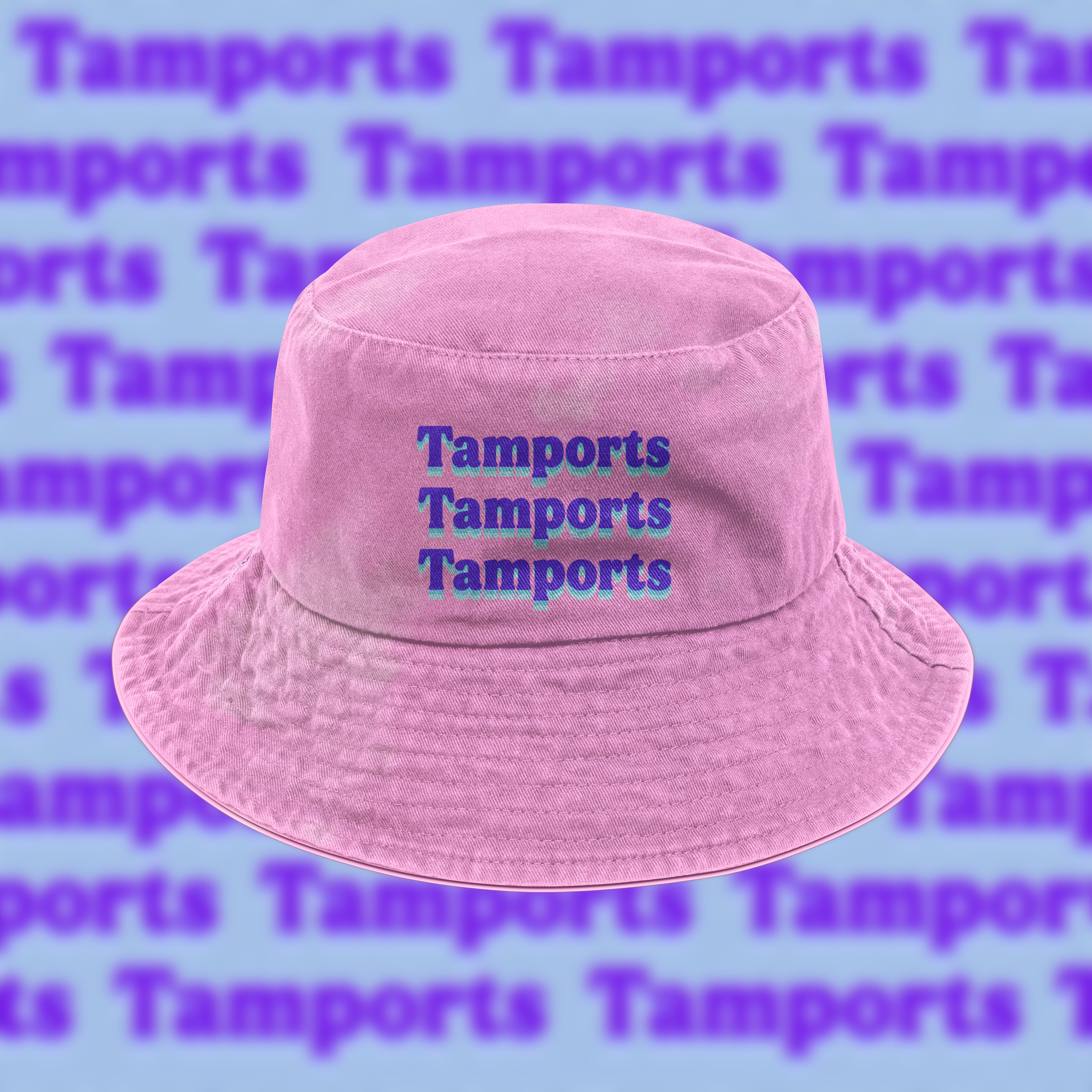
The plan for "Tamports" would instead of putting them in CVS or regular stores, be put in vending machines, specifically in clubs, bars, and even college campuses. The gimmick can stretch out to more than just cigarette packaging, like merch being put in a similarly packaged item that is actually bad for you, and bringing attention to the stigma of something that is essential being cast in a negative light.
Schematic
After sketching out a basic concept, I moved to Blender 3D to help better visualize and mockup the schematics for my product. My initial concept didn't have supported Tampons, only unsupported.
It was brought to my attention that unsupported Tampons when used can be unsanitary. So I created two ideas for packaging, one with supported Tampons, and the other unsupported but with a compartment that holds sanitary napkins.

Poster Ads
Continuing with the use of the vintage Newport style I am using for "Tamports", I chose to create two different advertisements that get my message across while keeping to the vintage roots I was pulling from. One of them showcases more variety and sizes.


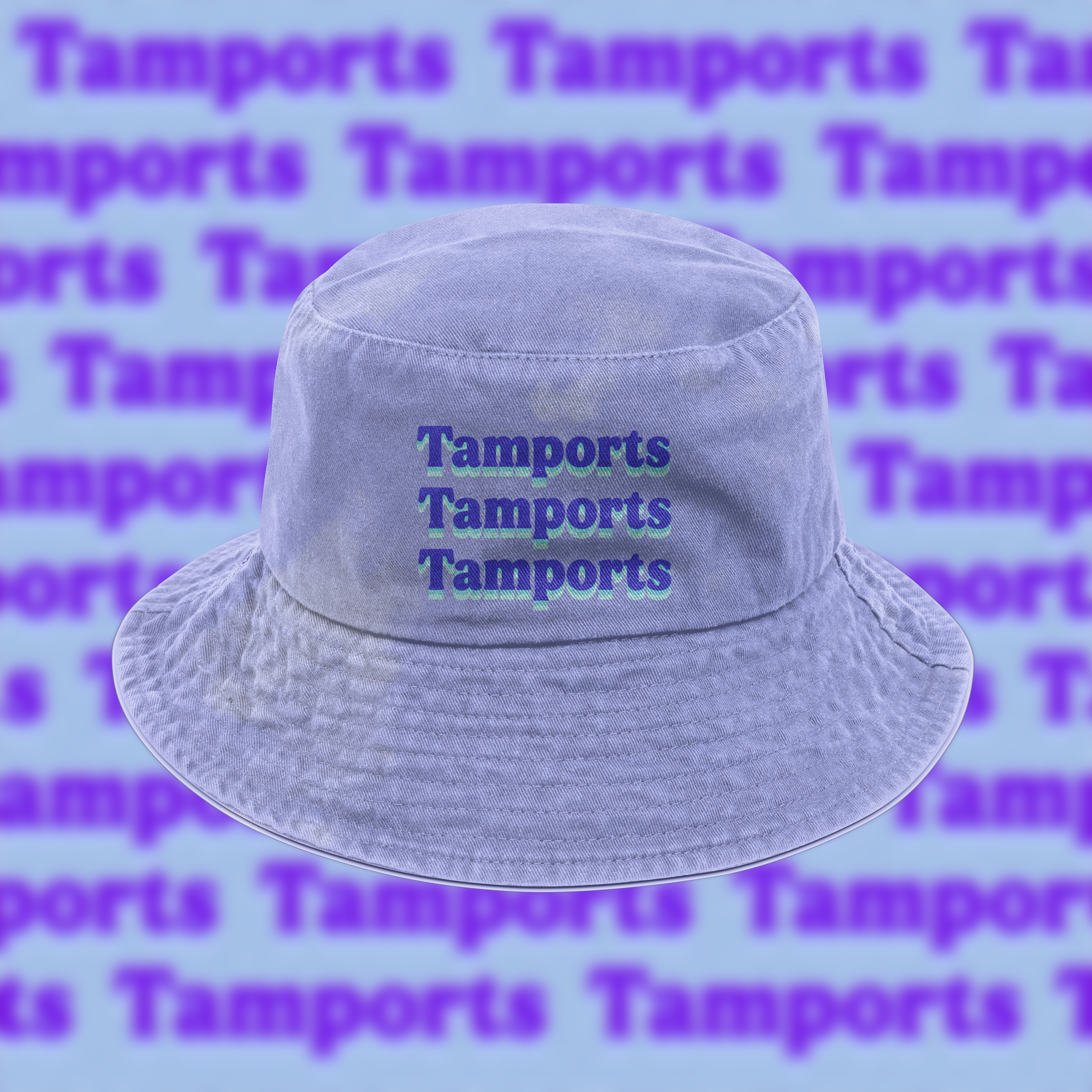
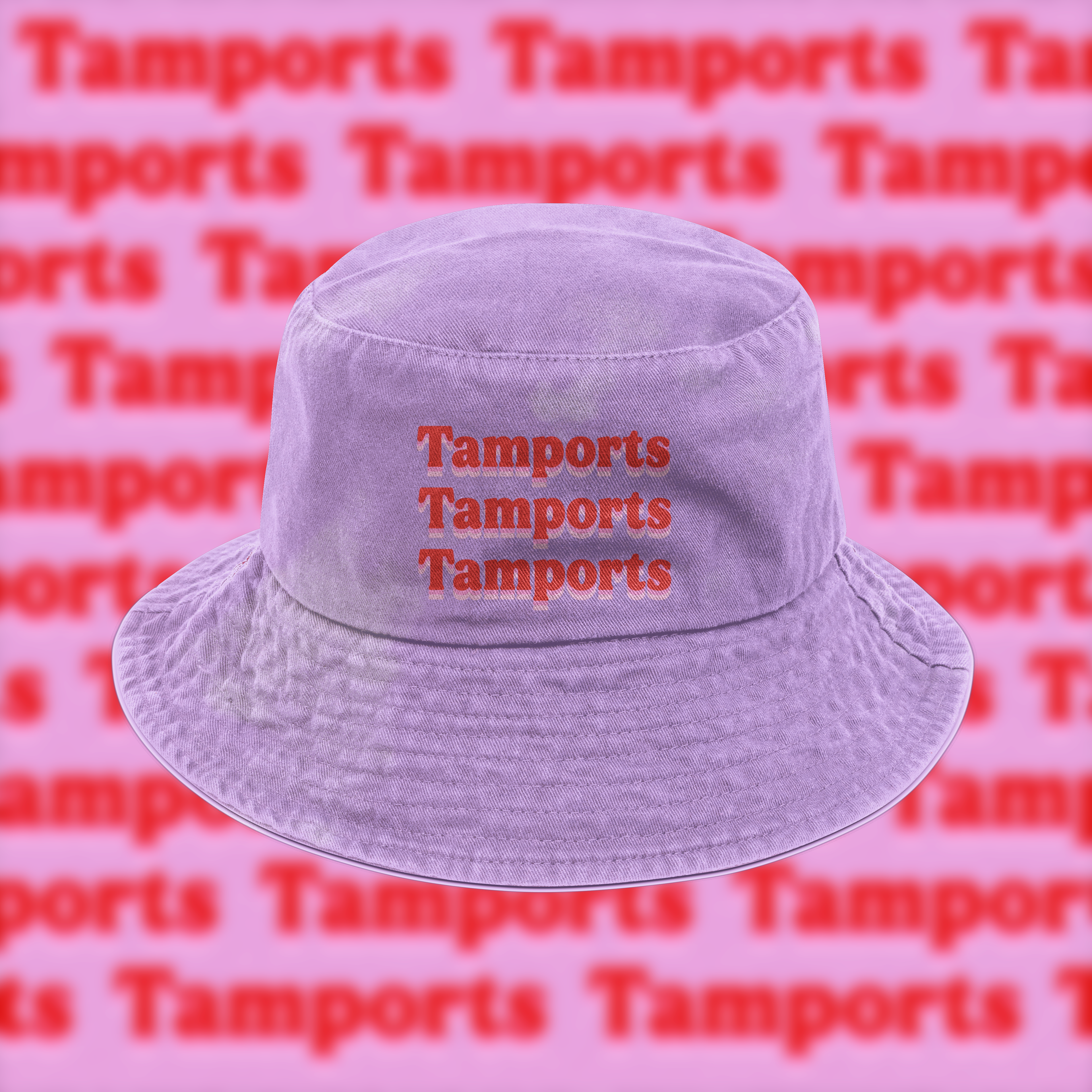
Collateral Mockups
Instead of putting Tamports in CVS or regular stores, Tamports will be located in vending machines, specifically in clubs, Festivals, bars, and even college campuses.
Stretching the idea of something that should be disliked ironically, and can be a fun way of packaging, I used burger/fast food containers for the merchandise packaging.


Social Media
Since the packaging and overall theme of Tamport's branding are vintage/trending visuals, I believe social media will have a large place in the advertising for this product. Because of that, I made an animation and mockups for what a social media campaign might look like for Tamports.